

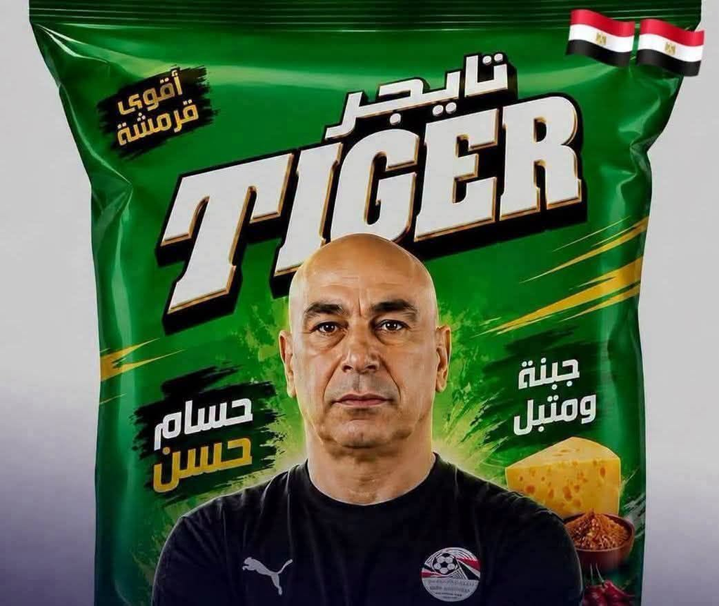
The image presents a striking promotional design built around a large green package of Tiger chips. At the center, a man wearing an Egyptian football shirt is positioned prominently against the packaging, creating an immediate connection between the snack product and football culture.
Green dominates the composition, giving the advertisement a strong and recognizable visual identity. White, black, and yellow typography creates sharp contrast, while the oversized “TIGER” lettering becomes the most noticeable graphic element.
Two Egyptian flags appear near the upper-right corner. Their placement adds a clear national theme to the design and strengthens the association between the product, local consumers, and the enthusiasm surrounding Egyptian football.
The central portrait introduces a human element into what might otherwise be a conventional package advertisement. His serious expression contrasts with the energetic graphics surrounding him, producing a visual balance between authority and excitement.
Football imagery is reinforced through the shirt and its sporting emblem. Rather than relying on a stadium or match scene, the composition uses clothing and national symbols to communicate its sporting context in a more direct way.
On the right side of the package, images of cheese and seasoning illustrate the flavor profile. These relatively small food elements remain secondary to the portrait and brand name but provide useful visual information about the product itself.
Arabic typography is integrated throughout the packaging, demonstrating how international-style branding can be adapted for a specific regional market. The combination of Arabic and English lettering allows the design to maintain both local relevance and broad visual recognition.
From a marketing perspective, the image reflects the continuing relationship between consumer products and popular sports culture. Football personalities, national colors, and sporting symbols are frequently used to create emotional associations that extend beyond the characteristics of the product.
The composition is deliberately crowded and energetic. Large lettering, vivid colors, food imagery, flags, and the central portrait compete for attention, yet the hierarchy remains clear enough for viewers to recognize the primary product immediately.
Overall, the image illustrates how packaging can function as more than a container. Through portraiture, national symbolism, typography, and sporting references, an everyday snack becomes part of a broader visual narrative connected with football enthusiasm and contemporary consumer culture.
©2016 Copyright All Rights Reserved by Velvet Glow Daily